
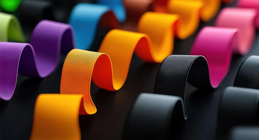
New research underscores that color preferences are far from universal. While it has long been known that women gravitate toward warmer shades such as red, orange, and pink, and men tend to prefer cooler hues like blue, green, and gray, recent studies provide richer insights into why. Experts point to a combination of biology, socialization, and cultural context as key drivers behind these preferences.
Age adds another important layer. As people grow older, the eye’s lens naturally yellows and vision contrast decreases, leading older consumers to favor softer contrasts and more muted palettes. Brands targeting senior markets often benefit from using lower-saturation colors with clearer contrasts to enhance readability and comfort.
Cultural differences are equally critical. A color associated with purity and weddings in one country may symbolize mourning or misfortune in another. For example, while white traditionally represents purity in Western cultures, it is associated with grief in parts of East Asia. Similarly, red, which connotes luck and prosperity in China, can imply danger or prohibition elsewhere.
These findings are especially relevant for global marketing and product design. International campaigns that rely on a “one-size-fits-all” color strategy risk alienating or confusing their audience. Researchers recommend that companies customize color palettes based on local demographics, cultural meaning, and even seasonal context to maximize impact.
By aligning color choices with gender, age, and cultural preferences, brands can create stronger emotional connections, improve user experience, and increase the effectiveness of advertising and packaging. As markets become more global and diverse, understanding the psychological and cultural underpinnings of color will be a powerful differentiator for businesses seeking to stand out in competitive industries such as consumer goods, fashion, and digital media.
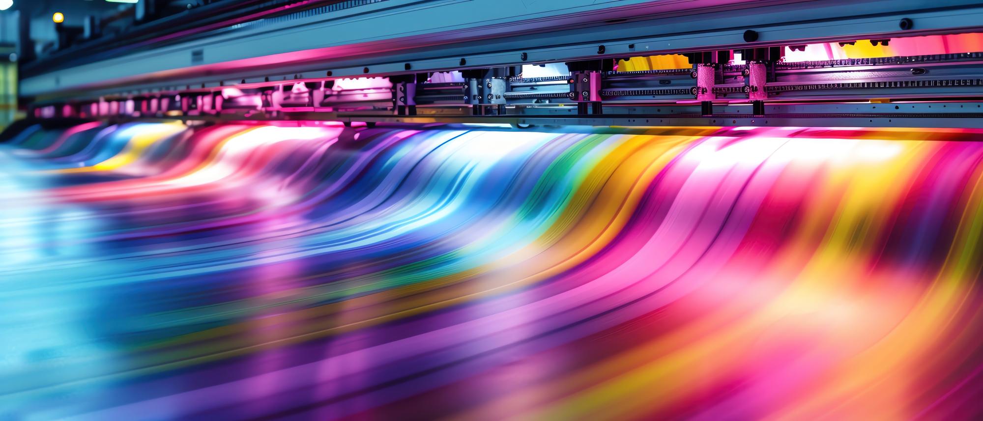
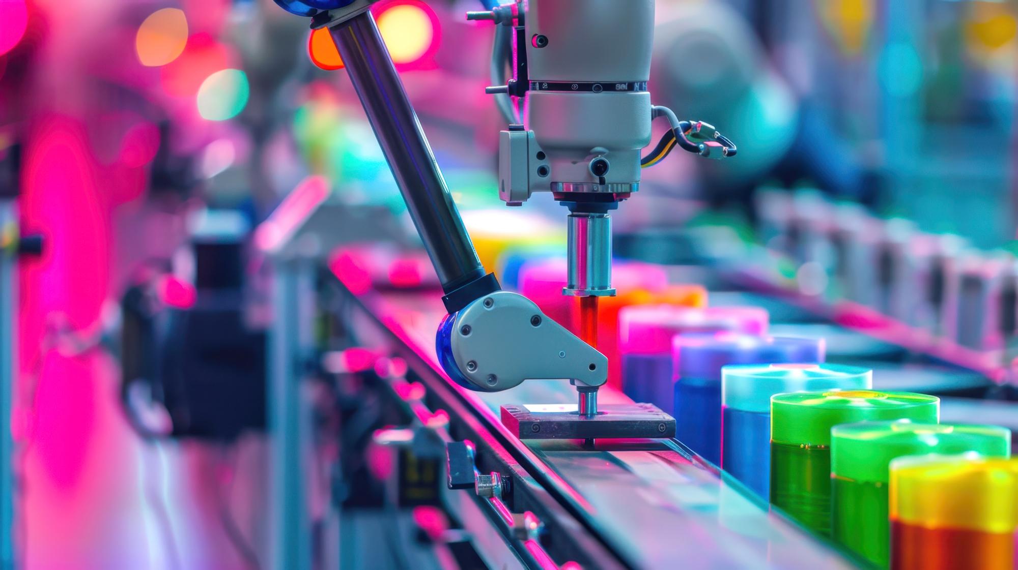
SunColour specializes in high-quality water-based flexographic inks for industrial applications, powered by modern technology and sustainable practices. We deliver premium performance, technical support, and environmentally safe products for the ink and packaging industry.
TANTAVİ MAH. ESTERGON
CAD. EXEN İSTANBUL F BLOK
NO: 24 F İÇ KAPI NO: 277
ÜMRANİYE / İSTANBUL

TR: +90 543 717 7777
UAE: +971 50 784 7077
© 2026 SunColour Co. | All Rights Reserved. Website Design by Davoodi.Net


